MISCELLANEOUS
The project pop-up shop.
ASHTON DESIGN 2024 YEAR IN REVIEW
Ashton Design was looking to improve on the success of the 2023 YIR, but was staring down a diverse range of projects to feature and no uniting concept. Fat Lip harnessed the power of space -- communal, professional, personal -- to help explain why the agency's work is so impactful, no matter the brief.
Supporting messaging was spread (and well received) across digital channels, including Ashton's LinkedIn, Instagram, and email newsletter. Speaking of, the newsletter enjoyed a 53.3% open rate, which was 16+ over 2023's open rate and 21+ over the industry average, and a 18.3% click-through rate, which was 8+ over 2023 and 16+ over the industry average.
Full report here. Design by Ashton Design.

TRANSIT CHOICES ADVOCACY BROCHURE
Transit Choices is a Maryland-based coalition of business organizations, institutions, and community members seeking to create an efficient and effective public transit system in Baltimore.” Their central question: D.C. and NYC have robust systems, why not us?
Facing a major budget vote and even larger headwinds at the end of 2024, TC asked for help creating a communication piece that would quickly explain the importance of funding public transport, stand out from the mountain of paper that lands on legislators‘ desks, and be delivered on an expedited timeline. Fat Lip concepted the idea of creating an interactive booklet, where the world was “turned upside down” once the budget was cut. Thematic messaging and visuals, designed by Ashton Design, mirrored this sliding-doors approach. It delivered in January 2025, just in advance of the critical vote.
The piece was highly effective, described by one key recipient as "a highly successful advocacy project“ and ”a well-executed piece—not just in terms of its physical design but also the way the messaging is structured and the bold points it makes.“
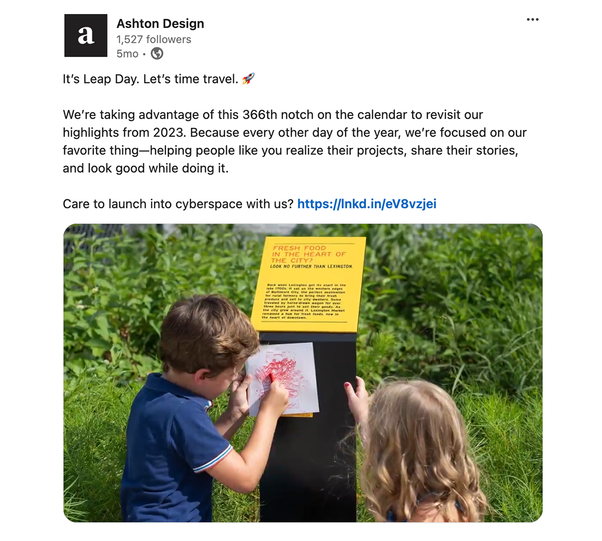
ASHTON DESIGN 2023 YEAR IN REVIEW
Ashton Design was highly in demand (rightly so!) at the start of 2024, which kept them from publishing their annual review. A teammate identified Leap Day as the glitch in the matrix that would allow us to publish the microsite two months late. Fat Lip got to work on positioning it as visual time travel, then organized the requested content in a way that told the story of the team's year.
People were up for a trip. The email blast had an open rate of 30%, 13+ industry average, and a click-through rate of 9%, 4+ industry average. Bonus points for the microsite's background gradient simulating travel through the tropho, strato, and mesospheres.
Full report here. Design by Ashton Design.
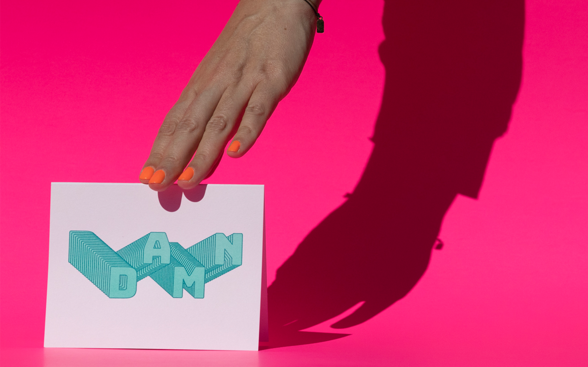
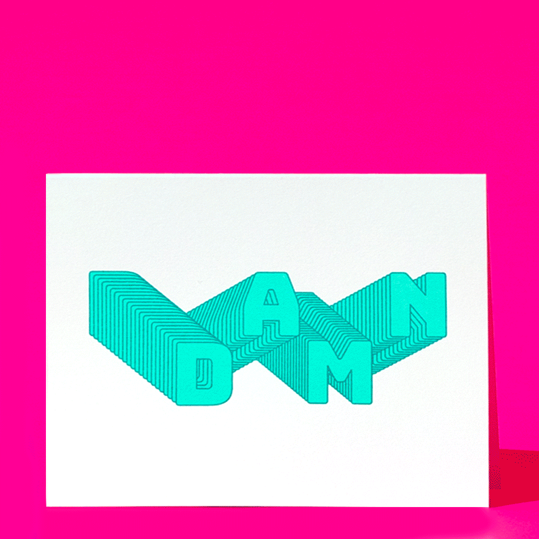
CURSE CARDS
According to multiple studies, swearing can help relieve stress, reduce pain, and provide emotional relief. There’s even a (not-yet-official) word for this foul-mouthed magic——lalochezia.
So, at the start of 2020, we decided to make greeting cards that might actually make letter writers and their loved ones feel better. People could choose from the adult pack (R-rated) or kid pack (G-rated). Everything from the print process (risograph) to the packaging (compostable) was carefully chosen for maximum graphic punch and minimal environmental impact.
Design by Michelle Ghiotti.